Table of contents
No headings in the article.
When it comes to creating visually appealing and well-structured web layouts, understanding the CSS Box Model is essential. The Box Model is a fundamental concept in CSS (Cascading Style Sheets) that defines how elements on a webpage are rendered and how their dimensions are calculated. In this article, we will delve into the details of the CSS Box Model, exploring its components and providing examples to illustrate its practical implementation.
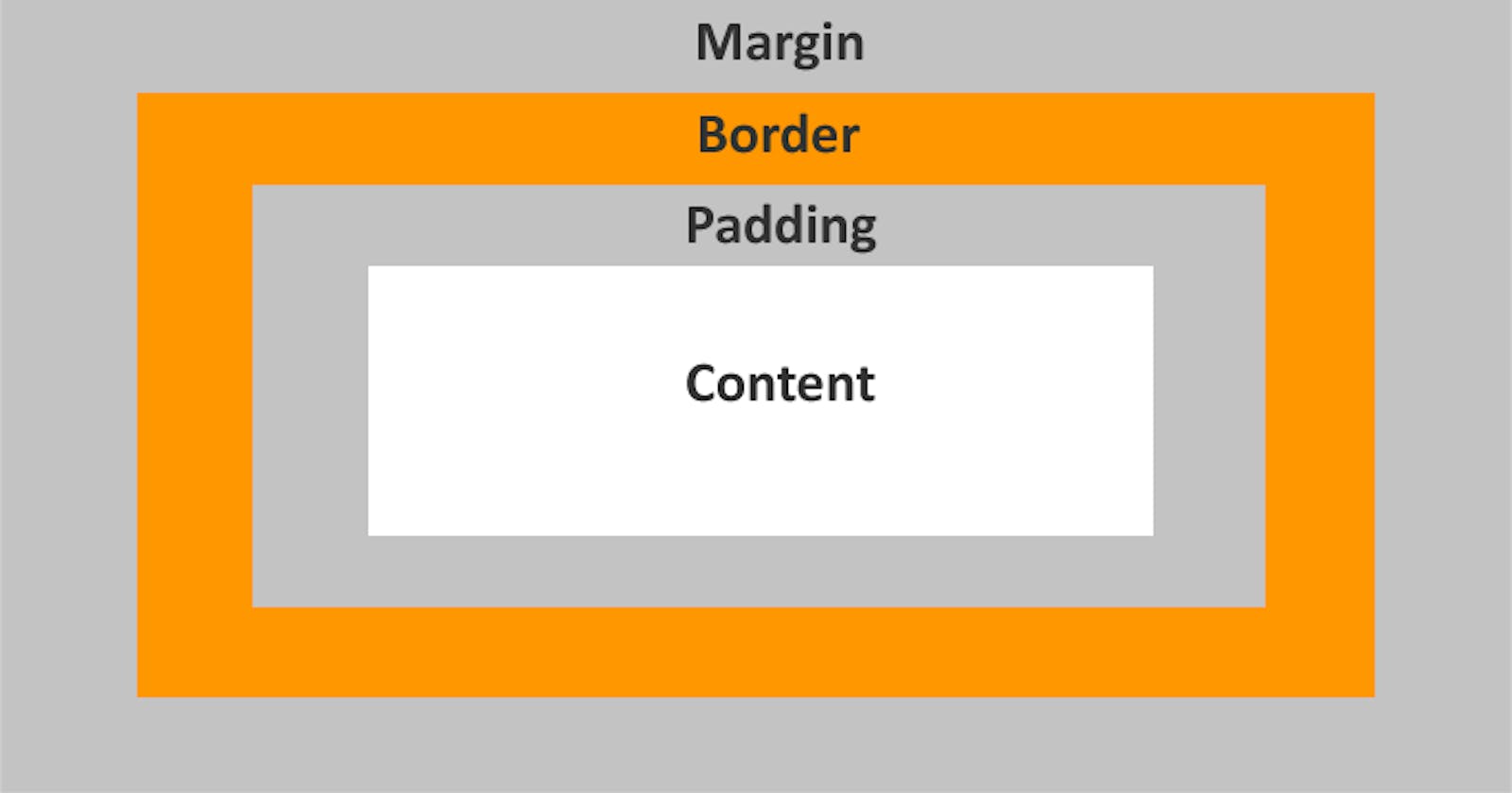
The CSS Box Model consists of four main elements: the content area, padding, border, and margin. Each of these elements plays a crucial role in determining the size, spacing, and positioning of an element within a webpage. Let's take a closer look at each component:
- Content Area: The content area represents the actual content of an element, such as text, images, or other HTML elements. Its dimensions are defined by the width and height properties. For instance, consider the following CSS code:
.box {
  width: 200px;
  height: 100px;
}
In this example, we set the width to 200 pixels and the height to 100 pixels for an element with the class "box."
- Padding: Padding refers to the space between the content area and the element's border. It provides a visual buffer that separates the content from the surrounding elements. Padding can be set individually for each side of an element (top, right, bottom, left) or using the shorthand property. Here's an example:
.box {
  padding: 10px;
}
In this case, the padding of 10 pixels will be applied to all sides of the element, creating equal spacing between the content and the border.
- Border: The border represents a line or area that surrounds the content and padding. It can be styled with various properties, such as color, width, and style. Here's an example that adds a solid black border with a width of 2 pixels to the previous example:
.box {
  border: 2px solid black;
}
The "solid" value defines the border style, while "black" specifies the color. The width is set to 2 pixels.
- Margin: Margin is the space that separates one element from another. It provides the outermost spacing around an element, creating gaps between neighboring elements. Similar to padding, margin can be defined individually for each side or using the shorthand property. Let's consider an example:
.box {
  margin: 20px;
}
In this case, the margin of 20 pixels will be applied to all sides of the element, creating equal spacing between neighboring elements.
Understanding how these components work together is crucial for controlling the layout of webpages. The total space an element occupies on a webpage is calculated by adding the content width/height, padding, border width, and margin together.
Here's a practical example that demonstrates the CSS Box Model in action:
<div class="box">
  <p>Content Area</p>
</div>
.box {
  width: 300px;
  height: 200px;
  padding: 20px;
  border: 2px solid black;
  margin: 30px;
}
In this example, we have a div element with the class "box" containing a paragraph (p) element. The element has a content width of 300 pixels, a height of 200 pixels, a padding of 20 pixels, a border of 2 pixels with a solid black color, and a margin of 30 pixels.
By manipulating these properties, you can create various layouts and achieve the desired spacing between elements on your webpage.
In conclusion, the CSS Box Model is a fundamental concept in web development that allows you to control the size, spacing, and positioning of elements within a webpage. Understanding its components—content area, padding, border, and margin—empowers you to create visually appealing and well-structured layouts. By leveraging the CSS Box Model, you can design engaging websites with precision and control.
