Table of contents
No headings in the article.
Introduction: In the world of web design, creating dynamic and responsive layouts is crucial. CSS Grid, a powerful layout system introduced in CSS3, revolutionized the way web developers approach layout design. With CSS Grid, you can create complex, grid-based layouts that adapt seamlessly to different screen sizes and devices. In this article, we will explore the fundamentals of CSS Grid and its key features, enabling you to harness its full potential in your web design projects.
Understanding CSS Grid: CSS Grid introduces a two-dimensional grid system, allowing you to divide your web page into rows and columns. Unlike its predecessor, CSS Flexbox, which focuses on one-dimensional layouts, CSS Grid provides precise control over both the horizontal and vertical axes of your layout. This level of control enables you to create intricate and versatile designs.
Grid Container and Grid Items: To begin using CSS Grid, you need to designate an element as the grid container by applying the display: grid; property. Once an element becomes a grid container, its direct child elements automatically become grid items. These grid items can be positioned within the grid using various grid-related properties.
Example: Let's start with a simple example to demonstrate the basic usage of CSS Grid. Consider the following HTML markup:
<div class="grid-container">
  <div class="grid-item">Item 1</div>
  <div class="grid-item">Item 2</div>
  <div class="grid-item">Item 3</div>
  <div class="grid-item">Item 4</div>
</div>
To create a grid layout, we apply the display: grid; property to the grid container:
.grid-container {
  display: grid;
}
By default, the grid items will be placed in a single column. To create a two-column layout, we can use the grid-template-columns property:
.grid-container {
  display: grid;
  grid-template-columns: 1fr 1fr;
}
In this example, 1fr represents one fraction unit of available space, dividing the space equally between the two columns. You can adjust the column widths by changing the values or using different units.
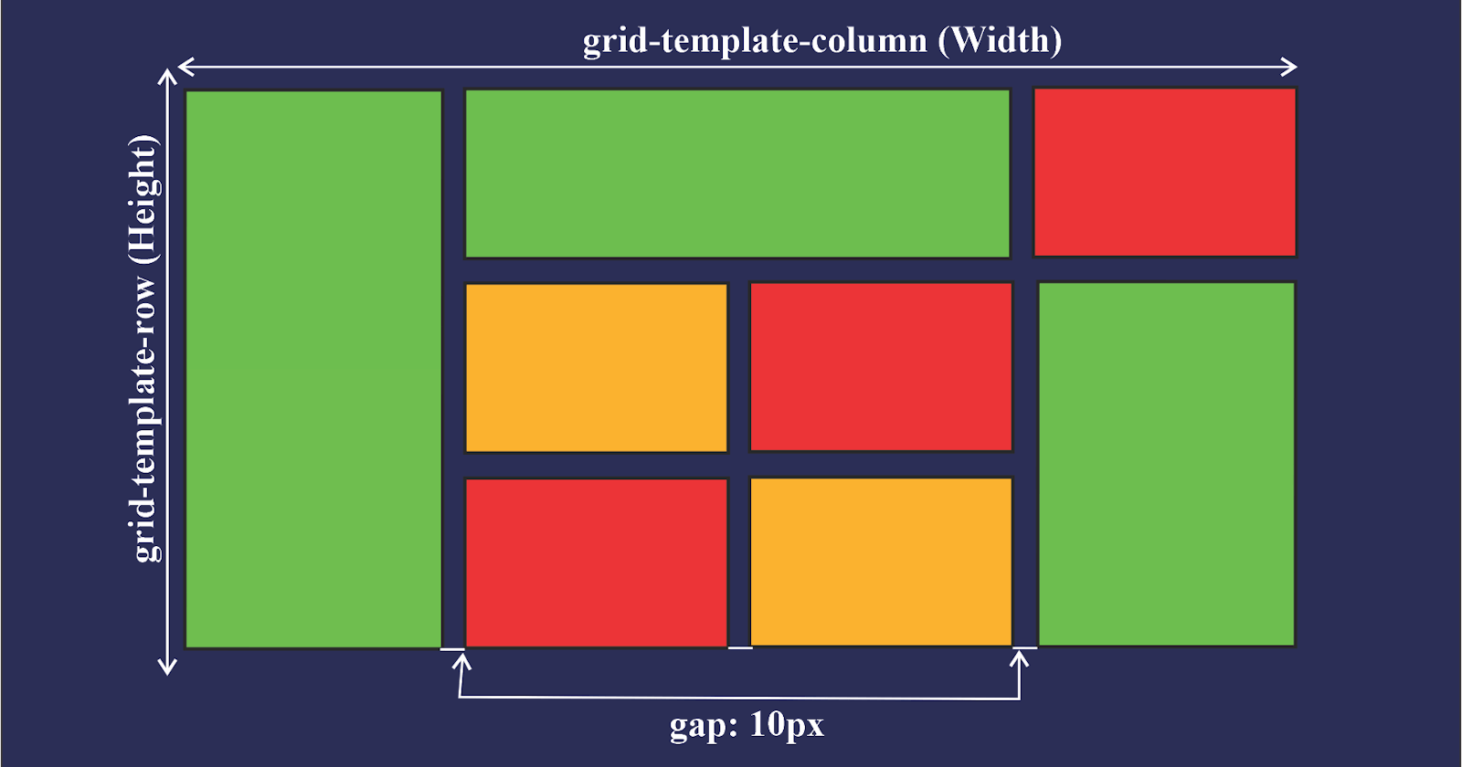
Grid Tracks and Grid Lines: A CSS Grid consists of horizontal and vertical tracks. Horizontal tracks form rows, while vertical tracks form columns. You can define the size and number of tracks using the grid-template-rows and grid-template-columns properties. Grid lines, which separate these tracks, can be referenced for precise item placement.
Example:
.grid-container {
  display: grid;
  grid-template-rows: 100px 200px; /* Two rows with different heights */
  grid-template-columns: 1fr 2fr; /* Two columns with different widths */
}
Placing Grid Items: CSS Grid provides several methods for positioning grid items within the grid. You can use the grid-row and grid-column properties to specify the starting and ending grid lines for an item, or use the shorthand grid-area property to specify both row and column positions in one declaration. Additionally, you can leverage keywords like span to span multiple tracks.
Example:
.grid-item {
  grid-row: 1 / 2; /* Item spans from row line 1 to row line 2 */
  grid-column: 2 / 3; /* Item spans from column line 2 to column line 3 */
}

/* Shorthand version */
.grid-item {
  grid-area: 1 / 2 / 2 / 3; /* Item spans from row line 1 to 2 and column line 2 to

 3 */
}
Grid Alignment and Spacing: With CSS Grid, aligning and spacing grid items becomes effortless. You can use properties like justify-items and align-items to control item alignment within their respective cells. Furthermore, you can control spacing between grid items using grid-gap or its individual properties, grid-row-gap and grid-column-gap.
Example:
.grid-container {
  display: grid;
  justify-items: center; /* Centers items horizontally within their cells */
  align-items: center; /* Centers items vertically within their cells */
  grid-gap: 10px; /* Gap between grid items */
}
Grid Responsiveness: One of the most significant advantages of CSS Grid is its ability to create responsive layouts with ease. By combining media queries with CSS Grid, you can adjust the grid template, track sizes, and item placement based on different screen sizes. This ensures that your layout remains visually appealing and functional across various devices.
Example:
.grid-container {
  display: grid;
  grid-template-columns: 1fr; /* Single column layout by default */

  @media screen and (min-width: 768px) {
    grid-template-columns: 1fr 1fr; /* Two columns on larger screens */
  }

  @media screen and (min-width: 1200px) {
    grid-template-columns: 1fr 1fr 1fr; /* Three columns on even larger screens */
  }
}
Conclusion: CSS Grid is a powerful layout system that provides unparalleled control and flexibility in creating responsive and visually stunning web layouts. By understanding its key concepts and applying them to your web design projects, you can take your layouts to the next level. Experiment with different grid configurations, positioning techniques, and responsive adaptations to unlock the full potential of CSS Grid and elevate your web design skills.
